Frederick Douglass

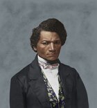
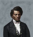
Thanks Mike. Other than what I have learned on my own in the last few years I have no background in art either. I appreciate you and others that give me criticism like this that I can use. It is one thing to color a photograph, but creating a shoulder is another.

Recently I was working on a 1890's image for a client and had to recreate most of a palm tree. That was a challenge as well, but I think doing something on the human body is more of a challenge.

Here is the train image as it was completed.
3c02856_w.jpg


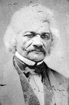
Here is the original LOC image:
3c02856v.jpg
The tree looks fine. As does the ground. Nice coloring, too.
 
The tree looks fine. As does the ground. Nice coloring, too.

Thanks Mike. I think one of the things that make the tree work better than extending the shoulder is that it can be more random. A shoulder and body has to have a specific proportion, little more of a challenge.
 
you are quite right. It is most definitely a challenge. I had thought what I suggested might solve, but I see the comparison and it is difficult. Perhaps, now that you have the white there in color, you actually reduce the saturation of the white area?? So that they remain white, but fall back a bit? I definitely would be trying any mumber of things at this point too! Love your palm!! nice work!!!
 
you are quite right. It is most definitely a challenge. I had thought what I suggested might solve, but I see the comparison and it is difficult. Perhaps, now that you have the white there in color, you actually reduce the saturation of the white area?? So that they remain white, but fall back a bit? I definitely would be trying any mumber of things at this point too! Love your palm!! nice work!!!

Thanks, I appreciate your comments. I am busy with a few other projects right now, so don't have to much time.

The palm was fun to put together. I was not planning on posting on this forum since it is a non-CW image, but it fit into the restoration thread and I did just finish it this weekend.
 
Thank you both for your comments. I agree with the comments on the whites of the eyes. It did cause me some issues when I was working on it. If you look at the original it was a bit dark and more "menacing" I tried adjusting the brightness levels, but ended up with eyes that had more gray than white in them.

I will try playing with them some more and see if I can keep the same quality that the original image had with the other changes I wanted.
Great work, but have to agree with the eyes and the color of the lips, the colored portion of the right eye seems to be off or non-circular and not same size as left. Eyes were always my hardest part to do as well , so I know how much of a pain they can be lol but overall very nice work... :smile:
 
Great work, but have to agree with the eyes and the color of the lips, the colored portion of the right eye seems to be off or non-circular and not same size as left. Eyes were always my hardest part to do as well , so I know how much of a pain they can be lol but overall very nice work... :smile:

Thanks wilber6150. I would like to update it, but have not had the time. I want to make the eyes more dark and piercing, like the B&W. Hopefully I will find some time to get back with it soon.
 
OK, I finally got back to this. Several of you suggested that it needed to be a bit darker. I was playing with some settings and think I may have gotten it. Let me know what you think of this vs. the original.

I like the revised one, my wife favors the original.

Original Douglass image:
I10044_w.jpg

Revised Douglass image:

I10044_w2.jpg
 

Attachments

  • I10044_w.jpg
    I10044_w.jpg
    238.2 KB · Views: 74
  • I10044_w2.jpg
    I10044_w2.jpg
    253.3 KB · Views: 68
I hope that I'm not misunderstood in what I say, I think that because of his parentage he was of a lighter complexion; but some people get a lot darker when they are in the sun for long periods of time. I actually like the skin tone on the original better.
 
I hope that I'm not misunderstood in what I say, I think that because of his parentage he was of a lighter complexion; but some people get a lot darker when they are in the sun for long periods of time. I actually like the skin tone on the original better.

Thanks for your comment. I played with it both ways, but liked the darker version due to the look of the B&W. Your opinion though is equally valid.
 
Re: the revised image - I think an option between the two might be even better.

Re: those darned eye whites. Are you pulling colors from anything in particular? It's my observation that people of African ancestry often have eye whites which are warmer colored than that. I think the cool color is creating a contrast between his eyes and face which wouldn't have existed. White people usually have blue-white eye whites, while black people often tend towards cream.
 
I agree with the above..I believe he states his father was Caucasian. Also, i think some work on the eye whites will help. subtle burn (as in dodge & burn for those not familiar) in the corners to give them their curve and more color.
 

Learn About Us
About CivilWarTalk
Contact the Webmaster
Meet the Staff
Link to CivilWarTalk
Join Our Community
Register
Browse Forums
View Today's Discussions
Search the Forum
Get Help
FAQ
Student Guide
Forum Rules & Etiquette
Copyright / DMCA

     Contact Us CivilwarTalk on Facebook CivilWarTalk on YouTube CivilWarTalk on Twitter RSS Feed

Bringing the American Civil War and More to Life.
© 1999 - , CIVILWARTALK, LLC - Site Version 10.0

SlaveryTalk.com - SecessionTalk.com - CivilWarTalk.com - ReconstructionTalk.com
Back
Top